Year
2016 – Present
Contributions
- UI/UX Design
- User Research
- Implement Style Changes
- Fix CSS/HTML Bugs
Background
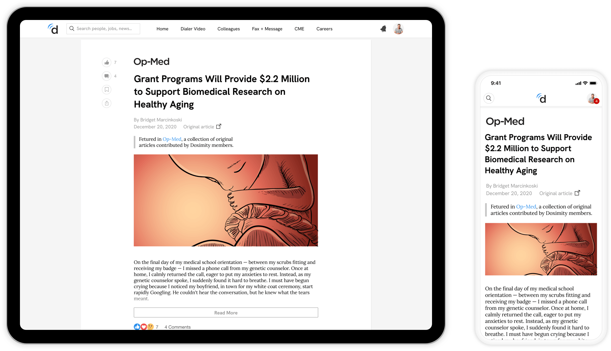
The newsfeed is a scrolling collection of articles customized to each Doximity member based on their speciality, network of colleagues, and clinical interests. This is located on the home page of the app. Doximity members can engage in discussions on every article, and may earn CME credits from medical articles featured on the newsfeed. I have been the lead newsfeed product designer since 2016.
Templating System
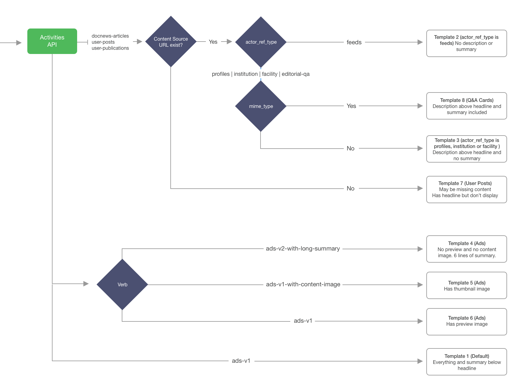
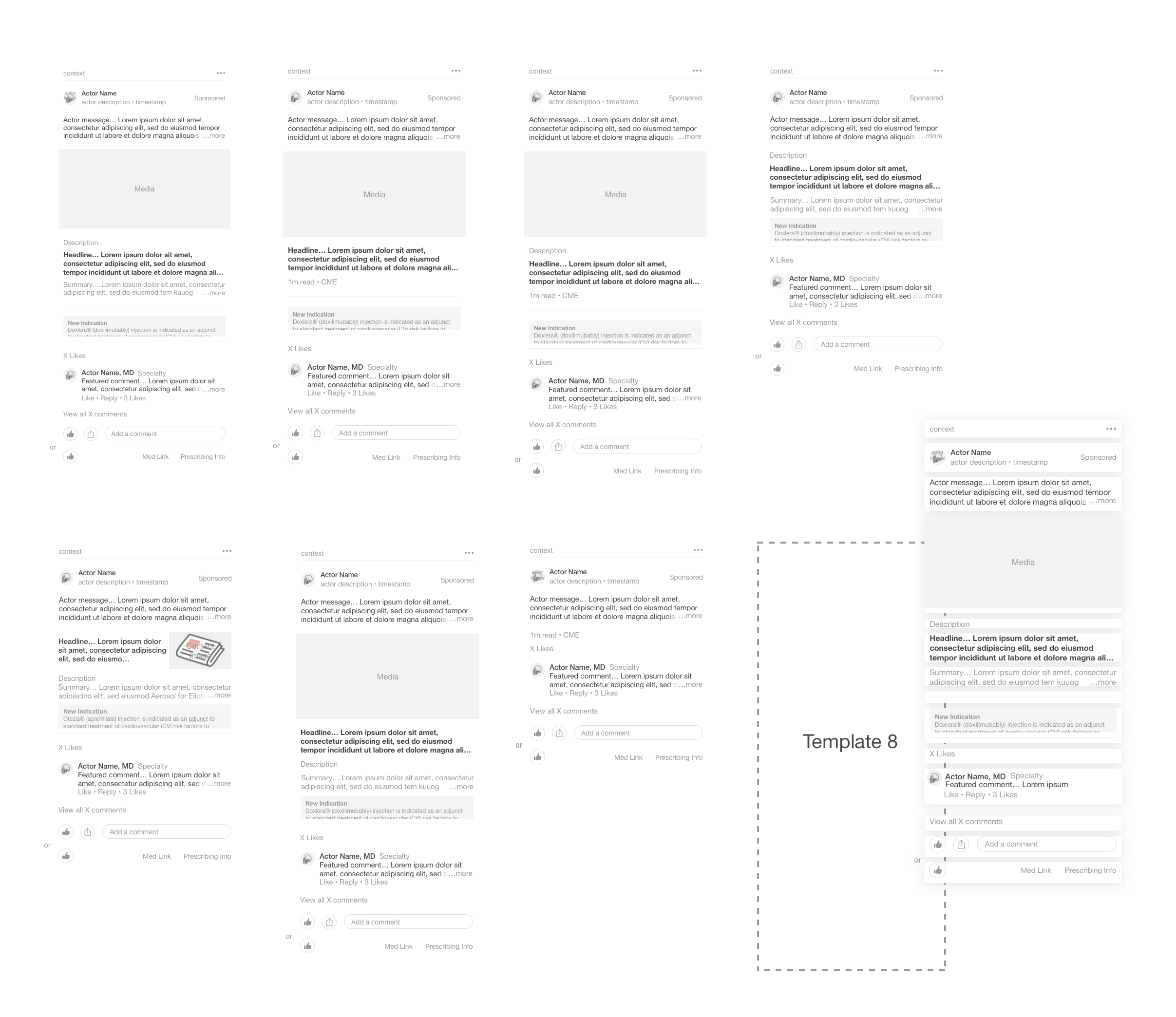
During the first step of the project, our Newsfeed team developed a component and templating system that would accommodate all of our content types. This approach allows us to share reusable code and make timely updates to the design system. Below is a UI logic workflow and a preview of the eight templates that were developed.
The Newsfeed
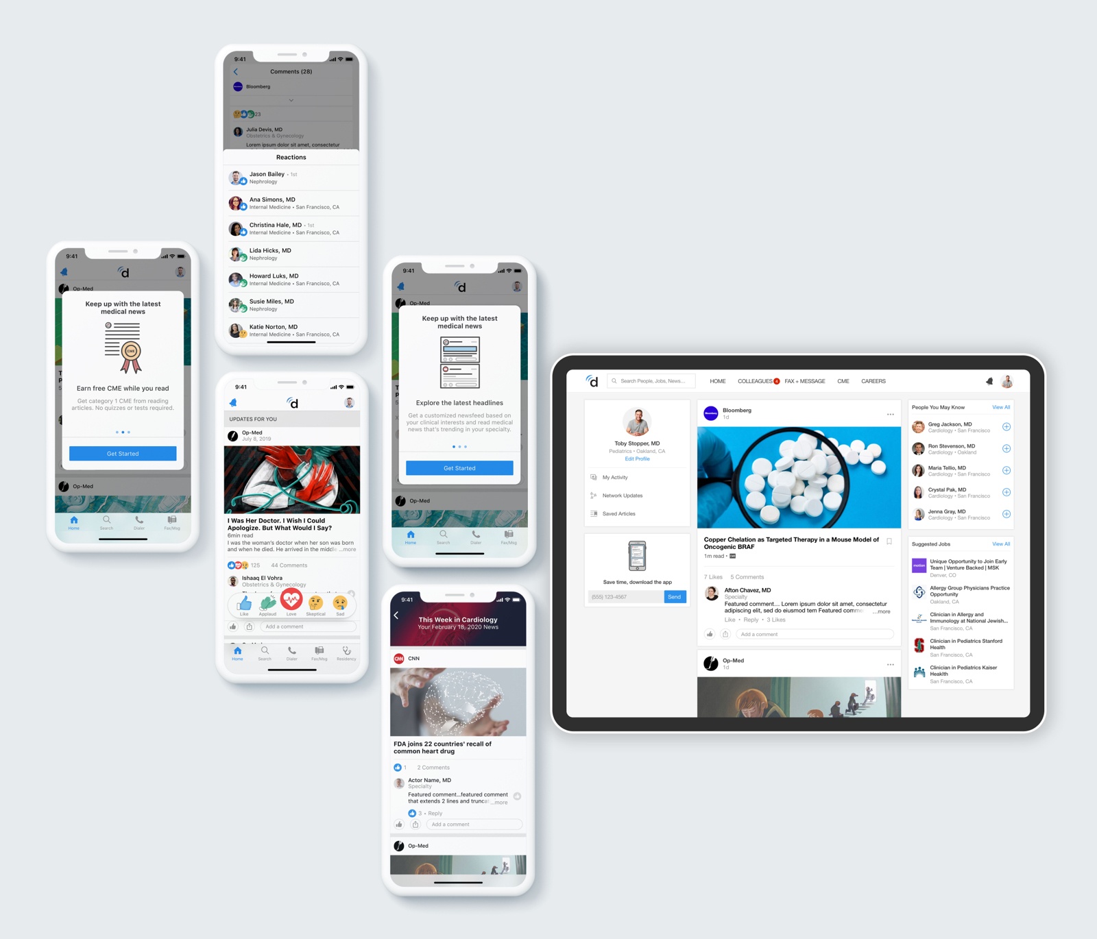
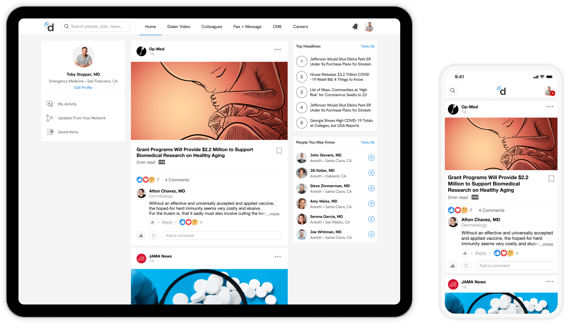
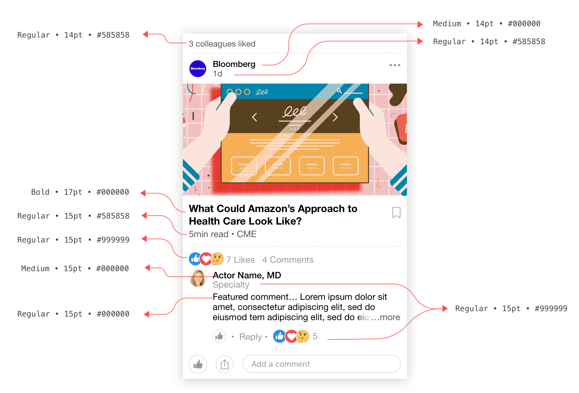
The goal of the redesign was to improve overall experience of the Newsfeed with updated cards and interactions. We focused on quick load times, and smooth transitions to articles and comment views. Another UX consideration was to equalize typography by only using a few font sizes and colors to make our cards more organized and digestible.
Card Typography
Media Types
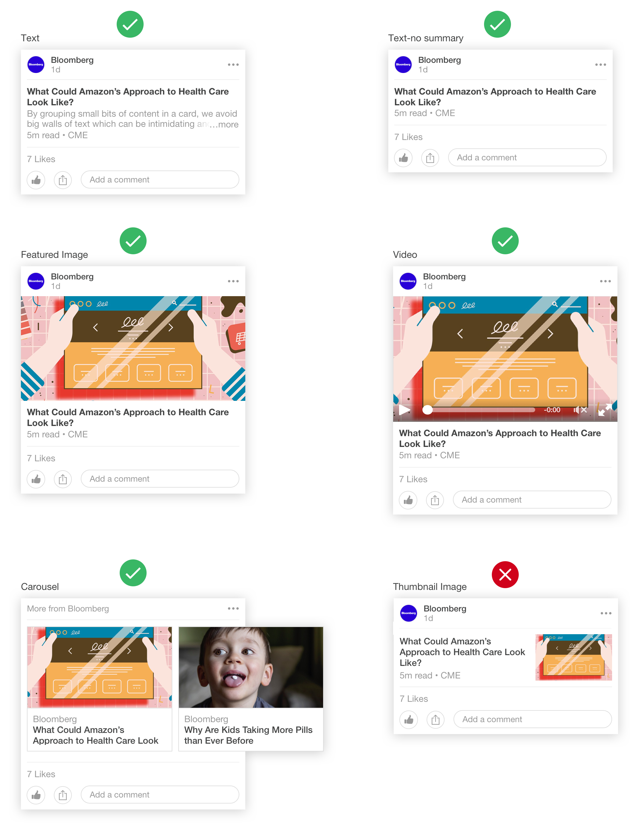
Another area of focus was the new streamlined card design that would be flexible enough to house all content types (Text, Featured Image, Video and Carousel).
More Context
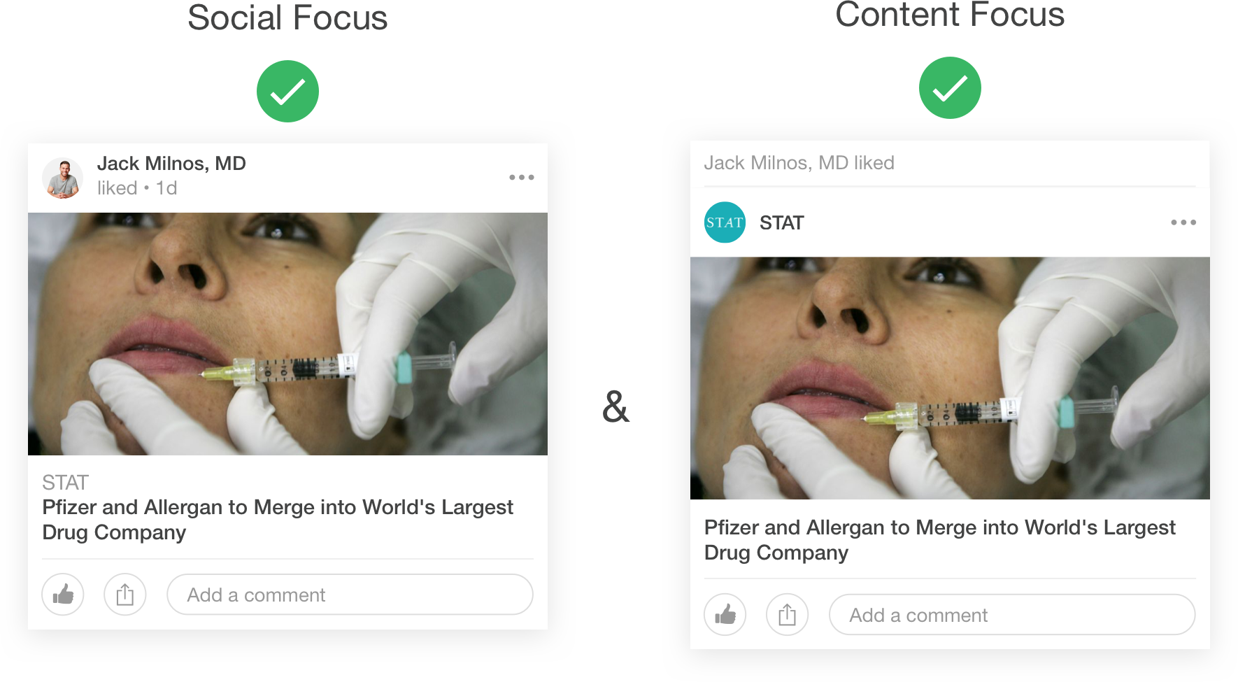
Context at the top of the card allows flexibility to focus on different actors. The card on the left is focusing much more on the social interaction because the user is in the actor image. The card on the right puts the publisher in the actor position and focuses more on the news content.
Social Bar
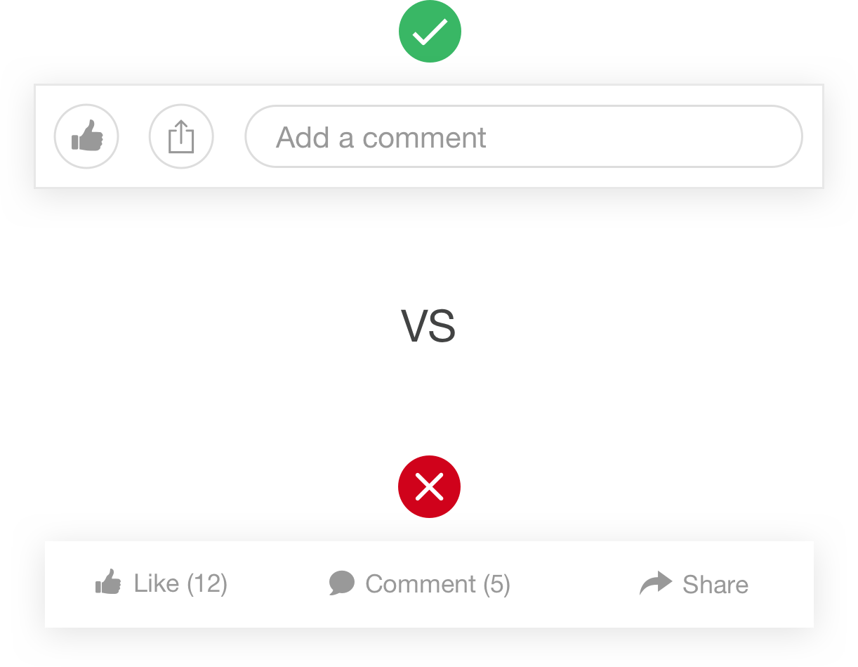
Improvements on the social bar have been made to encourage social engagement. A comment input will be displayed prominently at the bottom of each card to allow users to comment directly from the newsfeed. The Like and Share options have also been refreshed with a new button style making them more noticeable and tappable.
The Article View
