
Doximity
Year
2018 – Present
Contributions
- UI/UX Design
- User Research
- Implement Style Changes
- Fix CSS/HTML Bugs
Background
Collections are a group of curated articles with a similar theme. The goal of this product was to create a skimmable reading experience to view groups of articles, and allow users to quickly stay up to date by subscribing to their content of choice.
Research
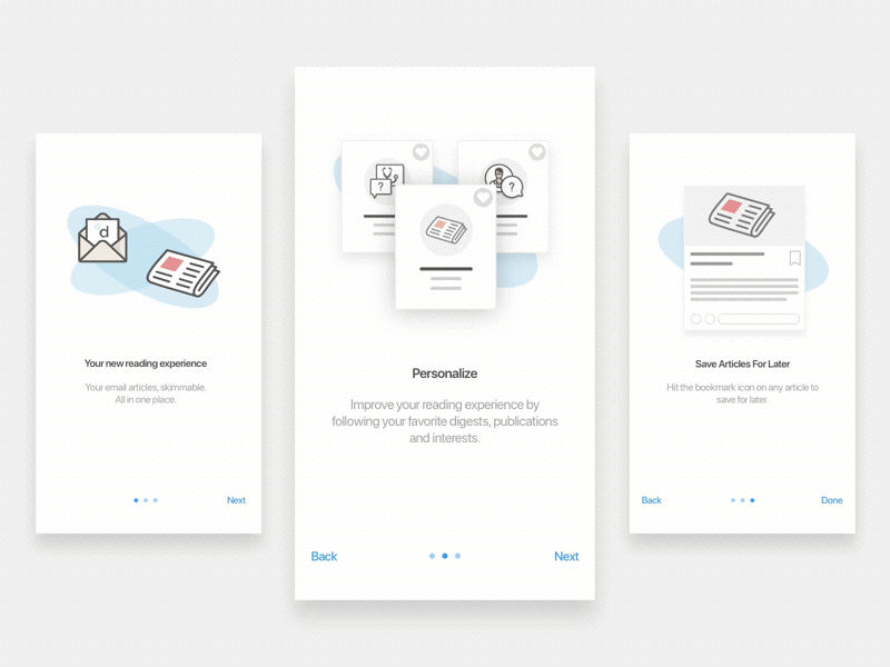
At initiation of the project we interviewed five users during a two week design sprint (four in person and one remote). I made an Invision prototype and new product workflow based on our hypothesis. We utilized a Lean UX approach, iterating on the Information Architecture and UI after each feedback session. Upon completion of our sprint, we were confident what we built was going to be a success.
A New Workflow
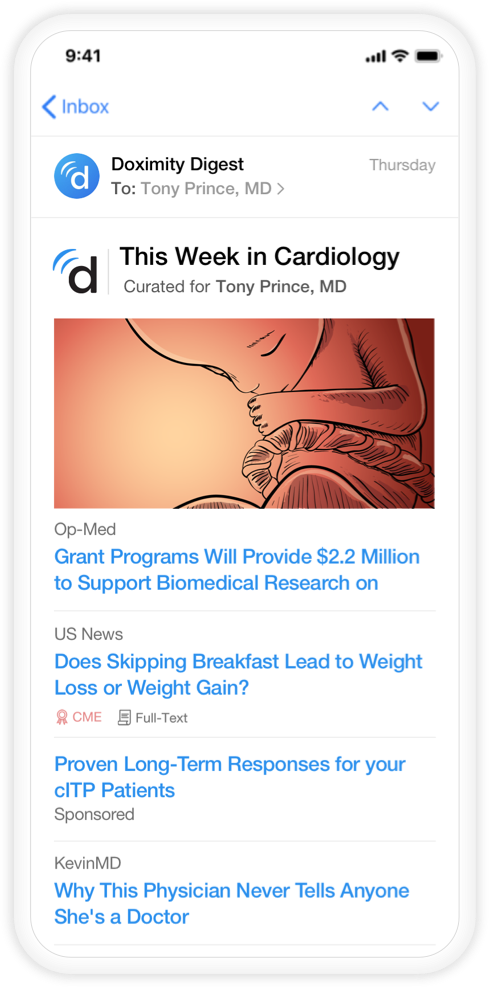
Doximity attracts users into the app through an emailed newsletter of curated articles tailored to each individual. Previously, once a user selected an article in their email, the app would direct them to that article page. Although our article page offered quick access to literature, we continued to search for a solution to keep users in the app longer and prevent the headache of having to go back and fourth to their email to view the next article. Below is a diagram of the new vs old workflow.
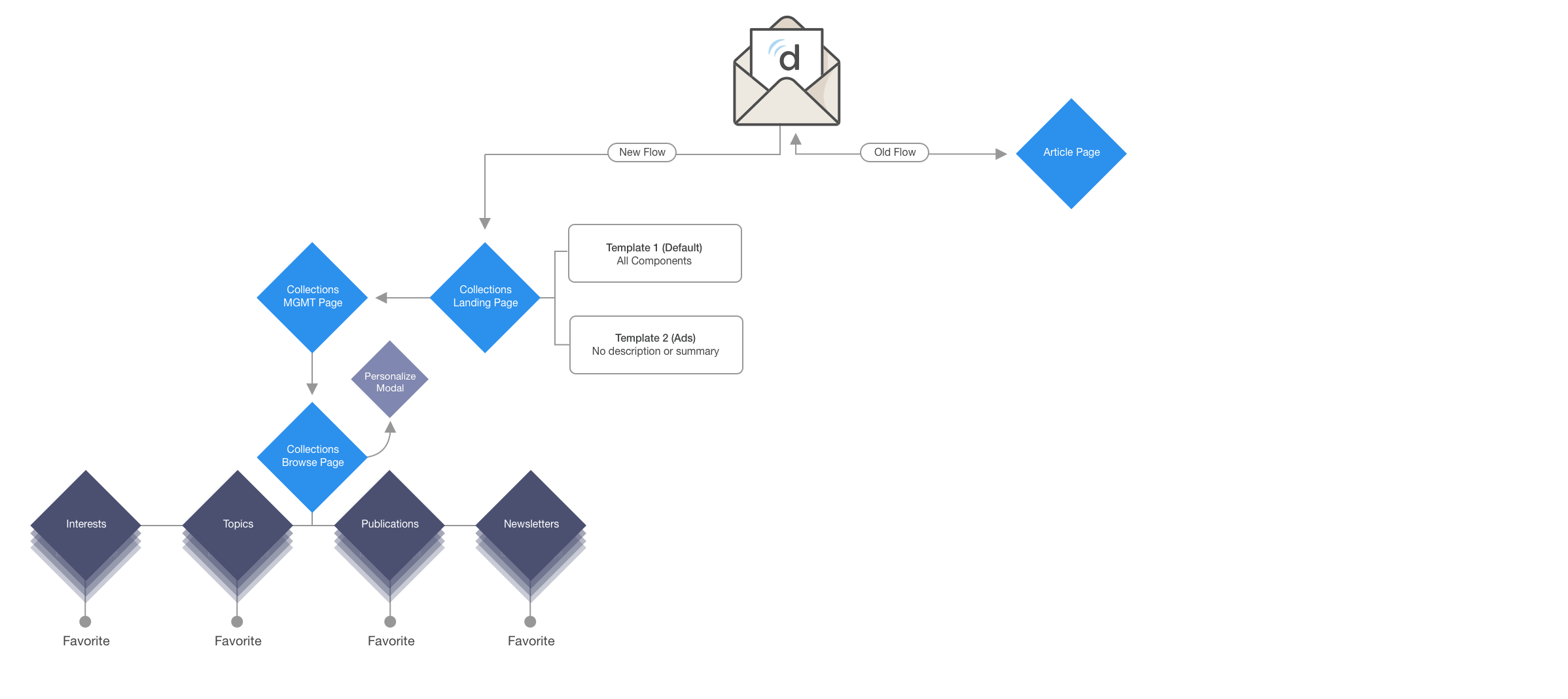
Collections is Born
Collections was born with a new set of features that would allow users the benefit of viewing all curated news in one place. It also provided them the ability to control and discover more personalized content.
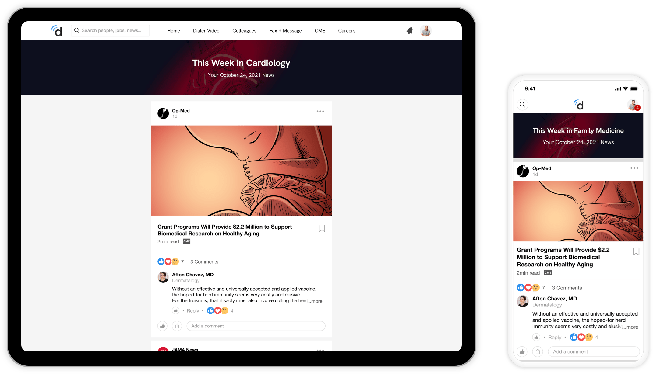
User receives digest email with the latest news from their specialty.
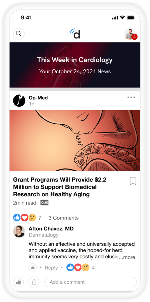
Collections Feed
Collections feed on Doximity with the selected email article card at the top.
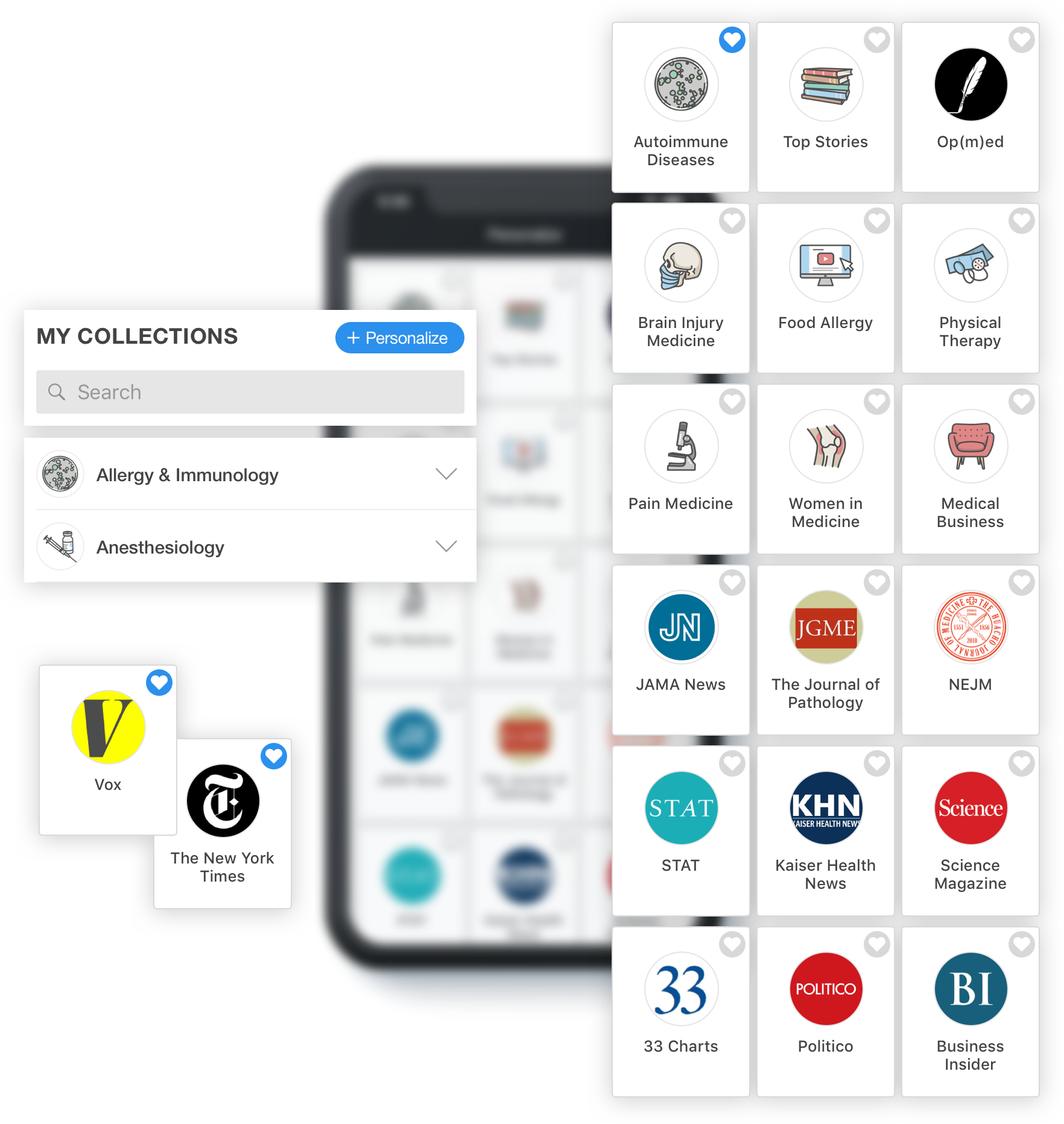
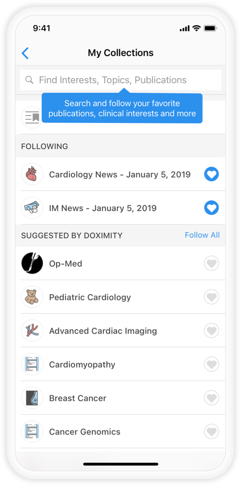
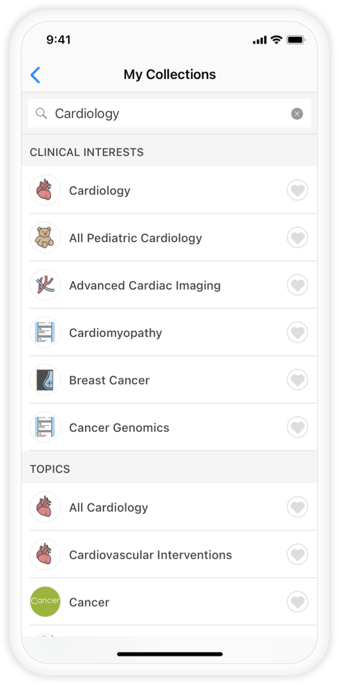
My Collections
User can manage their subscriptions and the content they want to follow.
Search
Searching for content to follow and personalize news experience.
Personalize
In order to improve usability it was of great interest for users to be able to sort through the noise in different areas of medicine and focus on news that matters most to them. Through interviews, we discovered user benefits to viewing content organized by clinical interests, topics, publications and newsletters. During the design sprint we also discovered that organizing by specialty made most sense. After completing the Information Architecture, I designed a UI that became familiar and enjoyable for users to browse and subscribe to personalized content.
Our successful algorithm and dedicated editorial team are responsible for gathering the curated news content that fills each personalized Collection.